Want to know why customers leave your website?
Then you’re in the right place.
We’ll walk through the top 5 reasons your small business website fails to turn visitors into paying customers.
Let’s jump right in then, shall we?
#1 – It looks bad on mobile
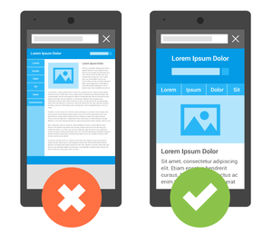
Over 80% of users will leave a website if it doesn’t look good on their mobile device.
The days of pinching and zooming are over. An annoyance that used to be an commonplace is now simply unacceptable.

If your website still requires users on a mobile device to scroll to the left or right to view content or zoom in to read or click anything on your website, they’ll leave and never come back.
In fact, in 2017, Google started penalising websites that weren’t optimised for mobile by moving them down in their search rankings.
That means if your website doesn’t look great on mobile, users may never get a chance to see your website because it won’t appear in their search results. Now that’s bad for business.
How can you fix it?
If you want users to stick around and engage with the content on your website, it needs to look great on everything.
There are a few ways to make that happen, but the best way (and Google’s recommendation) is to make your website mobile responsive.
A mobile responsive website is one that automatically resizes or hides elements on a web page to make it look good across devices.
#2 – It’s slow to load
Humans have a shorter attention span than goldfish!
You still with me?
Good.
Then it’s no surprise to learn if your website takes too long to load, visitors will retreat before they even get there.
That’s not a good first impression!
But how long is too long?

Most users expect a website to load in 2 seconds or less. That means that they need to be able to view the content and use the website in under 2 seconds.
Obviously, some people are more patient than others, but most people hit their limit around 5 seconds.
How can you fix it?
There are a number of factors that go into website speed.
Image optimisation, loading code from 3rd party resources, streamlining your website coding…the list goes on.
But the single most important factor in improving your website’s speed is quality hosting.
Every website has a host. When a visitor goes to your website, it’s the host that delivers your content to them. They manage all the technology that keeps your website up and running.
So make sure you’re using a quality host that’s known for delivering speed and reliability.
#3 – Bad Calls-To-Action (CTA)
A call-to-action (CTA) is simply an invitation to take a specific action on your website.
The invitation itself depends on your business and your customer, and your calls-to-action should reflect that.

Here are some common call-to-action mistakes we see on lots of websites.
- It’s not benefits driven
- It scary to click
- It’s hidden
- Too many
Benefits Driven
The benefit to the user should be clear in your CTAs.
If you’re an accountant looking to attract tax preparation clients, instead of saying something boring like ‘Book an appointment’ or ‘Contact us’, use a benefit to drive the CTA.
#4 – Poor design
A visitor’s first impression of your business is largely driven by the design of your website, and it’s one of the most critical elements for the success of your online efforts.
Many small businesses have websites that were designed years ago. But times have changed.
To avoid having your website design age quickly, choose clean and simple layouts that are easy to navigate and not overwhelming to the visitor.
A clean and simple design will allow your website to look fresh and modern for years to come.
How can you fix it?
A poorly designed or outdated website can be easy to fix with the right help.
Don’t be seduced by cheap website design companies that don’t take the steps necessary to align your website with your business goals.

Speak to a digital marketing or website design team (like us!) that works closely with your business to ensure your website returns value.
#5 – Confusing navigation
If your users can’t figure out where to go to answer the questions they’re looking for, they’ll leave your website in a hurry.
Having a simple and predictable navigation structure allows users to get to the right spot quickly and easily.
If you have a lot of products or services on your site, allow users to easily narrow everything down so they don’t get lost in a forest of choices.
